Introducing Our New Brand: A Message From Akilah’s Founder
Akilah founder & CEO Elizabeth Dearborn Hughes explains our rebranding process, a development eight years in the making!
When Akilah launched in January 2010, we didn’t have the budget to design a fancy website or nice promotional materials. I was personally responsible for building and maintaining our website, social media, email newsletters, and all fundraising and communications work — in addition to operations, finances, and academics on campus.
Needless to say, our brand and logo were a bit of an afterthought. As Akilah grew larger and more sophisticated, we knew that our brand wasn’t serving our goal of establishing ourselves as a serious and professional academic institution.
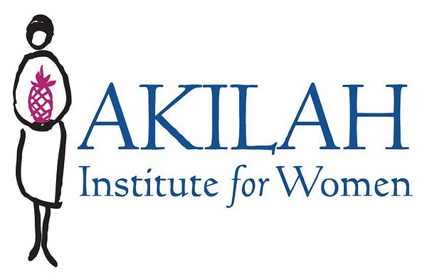
Akilah’s first logo.
Our first campus consisted of two rooms, and we offered one diploma program, Hospitality Management. Our logo, a women holding a pineapple (the international symbol of hospitality), captured our work and spirit at the time. But over the last eight years, we’ve evolved into an international institution with students from five countries and a campus in downtown Kigali with space for 3,000 students.
We’ve added new diploma programs in Information Systems and Business Management & Entrepreneurship, an on-campus Incubation Center, and a startup competition. Our students are winning national debate tournaments, presenting at conferences, and graduating with jobs far beyond the hospitality industry. The pineapple no longer served us.
After several small iterations of our brand and logo, we realized that our brand identity no longer matched our reality. We made the decision to redefine our brand with intention.
Our new logo
Last year we kicked off an intensive rebranding process with design agency FiveStone to develop the logo, colors, and imagery that will accompany Akilah’s next phase of growth beyond Rwanda.

We wanted something new and fresh but also connected to our original roots. The leaf within the “A” is inspired by leaves and wreaths on traditional seals and university logos. The leaf also represents growth and transformation and Akilah’s drive to become a more green and environmentally friendly institution.
We didn’t want the new logo to feel too old-fashioned or stuffy because as a team, we’re disruptive, forward-thinking, and always inspired to try new things. The asymmetrical “A” gives the logo an innovative edge. It reflects our unique identity as a future-focused college for women that combines traditional academic rigor with new learning methods.
The process
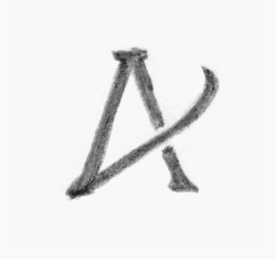
Arriving at the finished product wasn’t easy. Rebranding is a time-intensive process that combines creative brainstorming with intensive self-reflection. FiveStone started by helping us define our brand characteristics: exuberant, disruptive, approachable, and focused on leadership. Those identifiers led to the first iterations of our new logo:
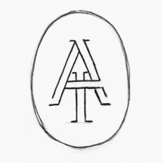
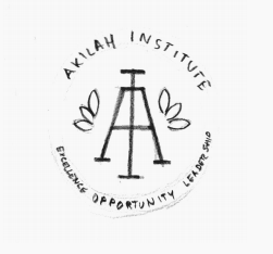
After the first round of options, we decided to pursue a logo with the elements of an academic seal. Over the years, we’ve strengthened our curriculum and introduced new diploma programs. The academic seal captured this growth and our identity as an accredited higher-learning institution.
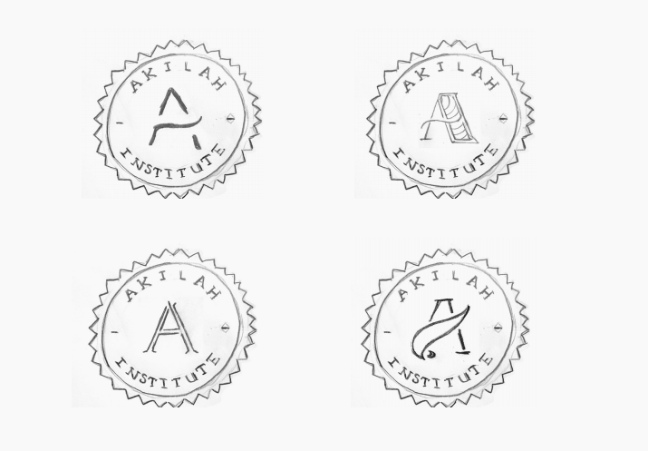
But it still didn’t feel quite right. Branding and design projects evoke very emotional responses, and everyone on our team had the same gut reaction: the seal logo just wasn’t us. How could we create a brand that balanced the seriousness of our programs and impact with the exciting and disruptive elements of a young, innovative organization?
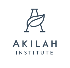
So we dropped the seal but kept the asymmetrical “A.” We adjusted the “A’s” feet, elongated its shape, and filled in one its legs. These may seem like minor adjustments, but those small changes transformed the logo into a symbol of strength, impact, and clarity. The finished product ticked all of the boxes for our new brand: academic, yet modern. Professional, but also sleek and innovative.
The development of Akilah’s new logo and brand took nearly six months.
After settling on the logo, the FiveStone team helped us select the colors, typography, patterns, and images to develop a holistic, fully realized brand. The rebrand process took nearly six months. But we like to think the full Akliah brand is the culmination of eight years of hard work.
So, when you look at our new logo, we hope you see the product of an international community of supporters, students, and partners, whose dedication has made Akilah what it is today: an innovative institution of excellence. We’re proud to have a new brand that reflects how far we’ve come, and one that will lead us into the future.
Watch our blog for updates on new programs, new campuses, and rapid regional expansion!
